Description
UIButton is an element of the NWN2's GUI which displays a button.
A simple UIButton is defined as follows:
<UIButton style="STYLE_SMALL_BUTTON" />
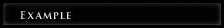
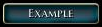
The above example will produce a minimalist Button. See below:
Attributes
| Attribute | Type | Default value | Predefined constants | Description |
|---|---|---|---|---|
| name | string | none | none | The name of the element, used to reference it in scripts. |
| x | int | 0 | ALIGN_LEFT, ALIGN_CENTER, ALIGN_RIGHT | Horizontal coordinates in the parent element. |
| y | int | 0 | ALIGN_TOP, ALIGN_CENTER, ALIGN_BOTTOM | Vertical coordinates in the parent element. |
| width | int | untested | PARENT_WIDTH, SCREEN_WIDTH | Width of the element. |
| height | int | untested | PARENT_HEIGHT, SCREEN_HEIGHT, DYNAMIC | Height of the element. |
| style | string | none | see Styles | Predefined button styles. |
| text | string | none | none | Text that appears on the button. |
| buttontype | string | none | radio, check | Type of button. |
| capturemouseclicks | bool | true | none | Set if the button should react on mouse clicks. |
| capturemouseevents | bool | true | none | Set if the button should capture mouse events. |
| MouseDownSFX | string | none | none | Sound to play on the mouse down event. |
| MouseDragSFX | string | none | none | Sound to play on the mouse drag event. |
| MouseDropSFX | string | none | none | Sound to play on the mouse drop event. |
| MouseUpSFX | string | none | none | Sound to play on the mouse up event. |
| color | hexadecimal | none | black, white, silver, gold | Color of the button (untested). |
| disabled | bool | false | none | Set if the button is disabled. |
| disabledcolor | hexadecimal | none | black, white, silver, gold | Color of the button when disabled (untested). |
| disabledtextcolor | hexadecimal | none | black, white, silver, gold | Color of the text on the button when disabled (untested). |
| dontrendermousegrab | bool | untested | none | Untested. |
| draggable | bool | false | none | Set if the button can be moved. |
| fontfamily | string | untested | see FontFamilies | Set the font family to use for rendering text on the button. |
| groupid | int | none | none | Untested. |
| groupmemberid | int | none | none | Untested. |
| handleactiontarget | bool | untested | none | Untested. |
| header | bool | false | none | Set if the button is the header in a listbox (may have some over uses). |
| hidden | bool | false | none | Set if the button is hidden. |
| hotbartype | string | none | HOTBAR_BARTER, HOTBAR_FEAT, HOTBAR_KNOWNSPELL
HOTBAR_DM_COMMAND, HOTBAR_BUTTON, HOTBAR_ITEM HOTBAR_TOGGLEMODE_BUTTON, HOTBAR_SPELL |
Untested. |
| prototype | bool | false | none | Set if the button is the default for the parent. |
| repeatcallback | bool | false | none | Untested. |
| scalewithscene | bool | untested | none | Untested. |
| strref | int | none | none | Reference of the string used as text for the button (untested). |
| update | bool | false | none | Triggers the OnUpdate event. |
Styles
The examples have been done following this definition:
<UIButton text="Example" style="STYLE_BUTTON" />
| Style | Description | Example |
|---|---|---|
| STYLE_SMALL_BUTTON | A simple small button | Normal:
Mouse over: On click: |
| STYLE_CLOSE_BUTTON | A button used for closing elements
(don't use the text attribute) |
Normal:
Mouse over: On click: |
| SQUARE_CHECKBOX_BUTTON | A checkbox
(don't use the text attribute) |
Normal:
Selected: |
| STYLE_LIST_BUTTON | A large button without background
Used in UIListBox elements Can be in a "selected" state |
Normal:
Mouse over, Selected:
On click, Selected and mouse over:
|
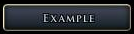
| STYLE_MENU_BUTTON_SML | A simple button | Looks like STYLE_SMALL_BUTTON, but bigger
Normal: |
| STYLE_SMALL_TAB | Usefull for creating tabs | Normal:
Selected: |
| STYLE_BIG_TAB | Usefull for creating tabs | Looks like STYLE_SMALL_TAB, but bigger
Normal: |
| STYLE_EMPTY_BUTTON | A small button without any layout
Used mainly as a base to define a button |
Normal:
|
| STYLE_SKILL_ICON | Usefull to display icons
Can be selected |
Better to replace the text with a UIIcon.
Normal: On click, Selected and mouse over: |
| BEHAVIOR_COLLAPSABLE_HEADER | Used as the header button in UICollapsable element | 
|
| BEHAVIOR_STATE_BUTTON | A round button
Reacts on clicks but doesn't seem to do anything else than playing a sound (don't use the text attribute) |
|
| BEHAVIOR_TEXT_BUTTON | A simple button with no background
Used mainly as a base to create other buttons |
|
| BEHAVIOR_ALL_BUTTON | A simple button that acts like STYLE_SMALL_BUTTON
Used mainly as a base to create other buttons |
Looks like STYLE_SMALL_BUTTON, but smaller
Normal: |
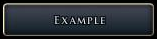
| STYLE_MENU_BUTTON | A simple button | Looks like STYLE_MENU_BUTTON_SML, but bigger
Normal: |
| STYLE_CHARGEN_TAB | A simple button with no background
Can be selected |
Normal: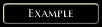
Mouse over: Selected: |
| STYLE_PLUS_BUTTON | untested | |
| STYLE_MINUS_BUTTON | untested | |
| STYLE_GROUP_BOX | untested | |
| STYLE_LARGE_BUTTON | untested | |
| STYLE_CHARGEN_LIST_BUTTON | untested | |
| STYLE_SKILL_TEXT | untested | |
| STYLE_LOOT_ICON | untested | |
| STYLE_LOOT_TEXT | untested | |
| CHAT_MODE_BUTTON | untested | |
| STYLE_TEXTTREE_BUTTON | untested | |
| MP_BROWSER_TAB_TITLE | untested | |
| MP_BROWSER_TAB_202 | untested | |
| MP_BROWSER_TAB_102 | untested | |
| MP_GAME_BUTTON | untested | |
| OPTIONS_BUTTON | untested | |
| MP_BROWSER_TAB_302 | untested | |
| MP_BROWSER_TAB_269 | untested | |
| SQUARE_RADIO_BUTTON | untested | |
| ROUND_RADIO_BUTTON | untested | |
| STYLE_EQUIP_BUTTON | untested | |
| STYLE_MODEBAR_BUTTON | untested | |
| OPTIONS_BUTTON_2 | untested | |
| STYLE_BUFF_BUTTON | untested | |
| PM_TOGGLE_BUTTON | untested | |
| STYLE_LIST_BUTTON_MED | untested | |
| STYLE_LIST_BUTTON_SML | untested |
Events
OnLeftClick
The OnLeftClick event occurs when the button is clicked with the left button of the mouse.
It is known to be usable with the following functions:
- Debug_GFX_ToggleDayNight
- Debug_GFX_ToggleGroundNormals
- Debug_GFX_ToggleRain
- Debug_GFX_ToggleShadows
- Debug_GFX_ToggleSky
- Debug_GFX_ToggleSnow
- UIButton_Input_AcceptGameOptions
- UIButton_Input_AddBuddy
- UIButton_Input_AddRosterMemberToParty
- UIButton_Input_AddToFavorites
- UIButton_Input_AllGold
- UIButton_Input_ApplyGameOptions
- UIButton_Input_AreaMapZoomIn
- UIButton_Input_AreaMapZoomOut
- UIButton_Input_BanPlayer
- UIButton_Input_BarterAccept
- UIButton_Input_BarterCancel
- UIButton_Input_BarterOffer
- UIButton_Input_BootPlayer
- UIButton_Input_BrowserInit
- UIButton_Input_CancelCharacterConfirmation
- UIButton_Input_CancelGameOptions
- UIButton_Input_CancelPartySelect
- UIButton_Input_CancelServerBrowser
- UIButton_Input_CharGenCancel
- UIButton_Input_CharGenCommit
- UIButton_Input_CharGenRecommend
- UIButton_Input_CharGenReset
- UIButton_Input_CharGenUndo
- UIButton_Input_CharSelectSetSelectedCharacter
- UIButton_Input_ChargenCustomizePackage
- UIButton_Input_ChooserSelectItem
- UIButton_Input_CloseContainer
- UIButton_Input_CloseSpellbook
- UIButton_Input_CloseStore
- UIButton_Input_CloseWorldMap
- UIButton_Input_CommitNewRosterPartyMembers
- UIButton_Input_ConfirmCharacterLogin
- UIButton_Input_ConnectToGameSpyGame
- UIButton_Input_ConnectToSession
- UIButton_Input_ConnectWithPassword
- UIButton_Input_ConnectionStatusCancel
- UIButton_Input_ContextNodeHandleLeftClick
- UIButton_Input_CreateAccount
- UIButton_Input_CreatorSelectItem
- UIButton_Input_DMCCameraToggle
- UIButton_Input_DMCControl
- UIButton_Input_DMCExamine
- UIButton_Input_DMCFullControl
- UIButton_Input_DMCGoto
- UIButton_Input_DMCHeal
- UIButton_Input_DMCImmortal
- UIButton_Input_DMCInvulnerable
- UIButton_Input_DMCJump
- UIButton_Input_DMCKill
- UIButton_Input_DMCLimbo
- UIButton_Input_DMCPauseToggle
- UIButton_Input_DMCRest
- UIButton_Input_DMCToggleAI
- UIButton_Input_DMCTrapsToggle
- UIButton_Input_DMCVisibilityToggle
- UIButton_Input_DeleteCharacterWithConfirmation
- UIButton_Input_DeleteSelectedLoadGameWithConfirmation
- UIButton_Input_DeleteSelectedSaveGameWithConfirmation
- UIButton_Input_DestinationGo
- UIButton_Input_DomainAdd
- UIButton_Input_DomainRemove
- UIButton_Input_ExitApp
- UIButton_Input_ExitToMainMenu
- UIButton_Input_ExportCharacter
- UIButton_Input_FeatAdd
- UIButton_Input_FeatRemove
- UIButton_Input_GenerateRandomName
- UIButton_Input_GetSessionDetails
- UIButton_Input_HandleAttitudeToggle
- UIButton_Input_HandleEAXCheck
- UIButton_Input_HandleHardwareCheck
- UIButton_Input_HandleIdentify
- UIButton_Input_HandleInviteCheckbox
- UIButton_Input_HandleMessageBoxCancel
- UIButton_Input_HandleMessageBoxOK
- UIButton_Input_HandleProviderSelect
- UIButton_Input_HandleReplySelection
- UIButton_Input_HandleSplitStackCancel
- UIButton_Input_HandleSplitStackOK
- UIButton_Input_HandleSplitStackStoreCancel
- UIButton_Input_HandleSplitStackStoreOK
- UIButton_Input_HandleStringInputBoxCancel
- UIButton_Input_HandleStringInputBoxOK
- UIButton_Input_HotbarDecrement
- UIButton_Input_HotbarIncrement
- UIButton_Input_IgnorePlayer
- UIButton_Input_InventoryButtonMaybeExamine
- UIButton_Input_LoadSelectedSaveGame
- UIButton_Input_LootAll
- UIButton_Input_MemorizeSpell
- UIButton_Input_MiniMapZoomIn
- UIButton_Input_MiniMapZoomOut
- UIButton_Input_MultiplayerDirectConnect
- UIButton_Input_OptionsAutoDetect
- UIButton_Input_PartyAction
- UIButton_Input_PlaySoundSetSample
- UIButton_Input_PlayerLogin
- UIButton_Input_PlayerMenuChoice
- UIButton_Input_PossessCompanion
- UIButton_Input_PreGameLoadSelectedSaveGame
- UIButton_Input_PregameCancel
- UIButton_Input_RefreshGSBrowser
- UIButton_Input_RefreshServerBrowser
- UIButton_Input_RemoveActionFromQueue
- UIButton_Input_RemoveBuddy
- UIButton_Input_RemoveFromFavorites
- UIButton_Input_RemoveRosterMemberFromParty
- UIButton_Input_ResetKeyDefaults
- UIButton_Input_Rest
- UIButton_Input_Rotate3DCamera
- UIButton_Input_Rotate3DCameraInventory
- UIButton_Input_SaveGameWithName
- UIButton_Input_SaveSelectedSaveGame
- UIButton_Input_ScreenClose
- UIButton_Input_ScreenOpen
- UIButton_Input_SelectGameRoom
- UIButton_Input_ServerOptionsRestoreDefaults
- UIButton_Input_SetBrowserSort
- UIButton_Input_SetGameSpyFilters
- UIButton_Input_SetFacialHairNext
- UIButton_Input_SetFacialHairPrevious
- UIButton_Input_SetHairNext
- UIButton_Input_SetHairPrevious
- UIButton_Input_SetHeadNext
- UIButton_Input_SetHeadPrevious
- UIButton_Input_ShowFeatDesc
- UIButton_Input_ShowMovie
- UIButton_Input_SkillDecrease
- UIButton_Input_SkillIncrease
- UIButton_Input_SkipDialog
- UIButton_Input_SpellAdd
- UIButton_Input_SpellRemove
- UIButton_Input_SplitGold
- UIButton_Input_SplitGoldPopup
- UIButton_Input_SpontaneousConversionToggle
- UIButton_Input_StartArea
- UIButton_Input_StartCharacterGeneration
- UIButton_Input_StartCharacterLevelUp
- UIButton_Input_StartMPGame
- UIButton_Input_StartModule
- UIButton_Input_StartMultiplayer
- UIButton_Input_StatDecrease
- UIButton_Input_StatIncrease
- UIButton_Input_StoreSellItemWithConfirmation
- UIButton_Input_ToggleFacialHair
- UIButton_Input_ToggleScreen
- UIObject_Input_ClearTextfield
- UIObject_Input_SetFocus
- UIObject_Misc_ExecuteServerScript
- UIObject_Misc_RequestCharacterUpdates
- UIObject_Misc_SetLocalVarString
- UIObject_Misc_StoreObjectData
- UIScene_OnAdd_SetUpServerOptions
- UIScrollBar_Input_JumpSlider
OnLeftDoubleClick
The OnLeftDoubleClick event occurs when the button is double-clicked with the left button of the mouse.
It is known to be usable with the following functions:
- UIButton_Input_CameraCompanion
- UIButton_Input_ChooserUseItem
- UIButton_Input_CreatorUseItem
- UIButton_Input_InventoryButtonActivate
- UIButton_Input_PickupItem
- UIButton_Input_StartArea
- UIButton_Input_StartModule
- UIButton_Input_UnequipSlot
OnMouseDropFailed
The OnMouseDropFailed event occurs when a drop of an element on the button fails.
It is known to be usable with the following functions:
- UIButton_OnDropFailed_BarterRemoveItem
- UIButton_OnDropFailed_DropInventoryItem
OnMouseDropReceived
The OnMouseDropReceived event occurs when an element is dropped on the button.
It is known to be usable with the following functions:
- UIButton_OnDropReceived_AddToRepository
- UIButton_OnDropReceived_BarterAddItem
- UIButton_OnDropReceived_PartyItemTransfer
- UIButton_OnDropReceived_SellToStore
- UIButton_OnDropReceived_SetContainerSlot
- UIButton_OnDropReceived_SetEquipmentSlot
- UIButton_OnDropReceived_SetInventorySlot
OnRadialRequest
The OnRadialRequest event occurs when the right button of the mouse is hold down on the button for a sufficent time.
It is known to be usable with the following functions:
- UIObject_OnRadial_DisplayActionTargetRadial
- UIObject_OnRadial_DisplayInventoryRadial
OnRightClick
The OnRightClick event occurs when the button is clicked with the right button of the mouse.
It is known to be usable with the following functions:
- UIButton_Input_TargetCompanion
- UIObject_OnRadial_DisplayBarterRadial
- UIObject_OnRadial_DisplayInventoryRadial
OnSelected
The OnSelected event is untested.
It is known to be usable with the following functions:
- UIButton_Input_BuildKeybindList
- UIButton_Input_Move3DCamera
- UIButton_Input_SetBuddyAvailability
- UIButton_Input_SetCharGenInfo
- UIButton_Input_SetCreatureColor
- UIButton_Input_SetGameSpyFilter
- UIButton_Input_SetGlobalMetaFeat
- UIButton_Input_SetGlobalSpellClass
- UIButton_Input_SetGlobalSpellLevel
- UIButton_Input_SetJournalPage
- UIButton_Input_SetJournalSort
- UIButton_Input_SetNameFilter
- UIButton_Input_SetRepositoryIndex
- UIButton_Input_SetStoreTab
- UIButton_Input_ShowObject
- UIButton_Input_ShowSkillDesc
- UIObject_Misc_SetCharGenData
- UIObject_Misc_SetLocalVarString
OnToolTip
The OnToolTip event is untested.
It is known to be usable with the following functions:
- UIObject_Tooltip_DisplayActionQueueData
- UIObject_Tooltip_DisplayMetamagic
- UIObject_Tooltip_DisplayObject
- UIObject_Tooltip_DisplayPartyBarData
- UIObject_Tooltip_DisplaySpell
- UIObject_Tooltip_DisplayStatusIcon
- UIObject_Tooltip_DisplayTooltipStringRef
- UIObject_Tooltip_SpellBookClass
OnUnSelected
The OnUnSelected event is untested.
It is known to be usable with the following functions:
- UIButton_Input_HideObject
- UIButton_Input_HideOverlayChildren
- UIButton_Input_SetGameSpyFilter
OnUpdate
The OnUpdate event occurs when the button is updated.
It is known to be usable with the following functions:
- UIButton_OnUpdate_BanPlayer
- UIButton_OnUpdate_BarterAccept
- UIButton_OnUpdate_BarterOffer
- UIButton_OnUpdate_BarterSplitGold
- UIButton_OnUpdate_BarterUpdateItem
- UIButton_OnUpdate_BootPlayer
- UIButton_OnUpdate_CheckCharGenStage
- UIButton_OnUpdate_CheckForLevelUp
- UIButton_OnUpdate_CheckGameSpy
- UIButton_OnUpdate_CheckStatusIcons
- UIButton_OnUpdate_ConnectionStatusCancel
- UIButton_OnUpdate_ContextNode
- UIButton_OnUpdate_ControlSelected
- UIButton_OnUpdate_DMCVisibilityToggle
- UIButton_OnUpdate_DisableClientPrivs
- UIButton_OnUpdate_DisplayGSPlayer
- UIButton_OnUpdate_EnableIfMultiplayer
- UIButton_OnUpdate_ManageStoreTab
- UIButton_OnUpdate_PartyAction
- UIButton_OnUpdate_SetCheckedIfLocalVarEquals
- UIButton_OnUpdate_SetMetaFeat
- UIButton_OnUpdate_UpdateBardButton
- UIButton_OnUpdate_UpdateBuddyAvailability
- UIButton_OnUpdate_UpdateEquipmentSlot
- UIButton_OnUpdate_UpdateIgnore
- UIButton_OnUpdate_UpdateInventoryButton
- UIButton_OnUpdate_UpdateInventorySlot
- UIButton_OnUpdate_UpdateLootSlot
- UIButton_OnUpdate_UpdateNotBardButton
- UIButton_OnUpdate_UpdatePlayerState
- UIButton_OnUpdate_UpdateSpellbookButton
- UIButton_OnUpdate_UpdateWorldMapButton
- UIObject_OnUpdate_ActionQueuePosition
- UIObject_OnUpdate_CheckForCharacters
- UIObject_OnUpdate_CheckForFacialHair
- UIObject_OnUpdate_DisableIfLocalVarEquals
- UIObject_OnUpdate_GetCharacterIcon
- UIObject_OnUpdate_UpdateCharSelectionCharacter
Examples
Here is how to create a simple button, that calls a script when clicked:
<UIButton name="button" text="Button" style="STYLE_SMALL_BUTTON" OnLeftClick=UIObject_Misc_ExecuteServerScript("gui_callback") />
More
Buttons can be used in a lot of manners, more on these later.